Font Tips – Below you’ll find 5 Font Tips for Presenters.
1. Use Standard Fonts Stick to fonts that are common to every computer. No matter how fabulous you think your font looks, if the displaying computer doesn’t have it installed, another font will be substituted – often skewing the look of your text on the slide.
Choose a font that is suitable for the tone of your presentation. For a group of dentists, select simple fonts. If your presentation is aimed at small children, then this is a time when you can use a “funky” font. However if this font is not installed on the presenting computer, make sure to embed the true type fonts into your presentation. This will increase the file size of your presentation, but at least your fonts will appear as you intended.
2. Don’t Use All Capital Letters Avoid using all capital letters – even for headings. All caps are perceived as SHOUTING, and the words are more difficult to read.
3. Sharp Contrast Between Fonts and Background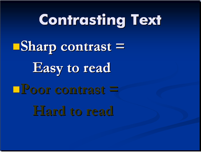 The first point and most important about using fonts in presentations is to make sure that there is sharp contrast between the color of the fonts on the slide and the color of the slide background. Little contrast = Little readability.
4. Make Fonts Large for Readability Don’t use anything smaller than an 18 point font – and preferably a 24 point as the minimum size. Not only will this larger sized font fill up your slide so there is not so much empty space, it will also limit your text. Too much text on a slide is evidence that you are a novice at making presentations.
5. Use Different Fonts for Headlines and Bullet Points Choose a different font for the headlines and the bullet points. This makes text slides a little bit more interesting. Bold the text whenever possible so that it is easily readable at the back of the room.
Now you can use Fonts Correctly in PowerPoint Presentations.